BRANDS
  • View All
BRANDS
  • View All
BRANDS
  • View All
FIND A SHOWROOM
BUY ONLINE
INSPIRATION
Products
Brands
Where to Buy
Search
Mark D. Sikes CLASSICS

Announcing Our New Collaboration

High Point Fall Market 2018

A Recap in Case You Missed It

The Chandelier Refresh

Giving Your Space New Life with a New Light

October 18, 2018
img

The Chandelier Refresh

Giving Your Space New Life with a New Light

October 18, 2018

When Katey and Paul took on designing their house, they put off the master bedroom for last. For many, the master bedroom is a challenge, as both people want to feel like it is totally their room and want to feel really comfortable in it. This might mean striking a balance not only between each other's tastes but conventionally masculine and feminine aspects. (We did a whole post on this subject here, if you're interested.) Their idea was to ground the space with the masculine hues of dark brown with the wooden floorboards and a "chocolate-velvet" bed, then contrast these with airy and glamorous feminine accents.

It was a great idea, but the first attempt didn't quite work

Then, working with interior designer Maddie Hughes, they swapped out the leopard print for white pillows and a lucite bench with angora throw, placed a beautiful rug that tied into the established palette under the bed, added a very tasteful window treatment, exchanged the white art triptych above the bed for one with earthy tones and gilded frames, and selected a new chandelier: Cielo by Corbett Lighting. In Katey's words, the effect of this chandelier and these textiles on the room was "transformative."

Below is the outcome. Get the whole scoop from Katey in her blog post on her site, Chronicles of Frivolity.


Photo by Madison Katlin | Design by Maddie Hughes | Home by Katey and Paul of Chronicles of Frivolity

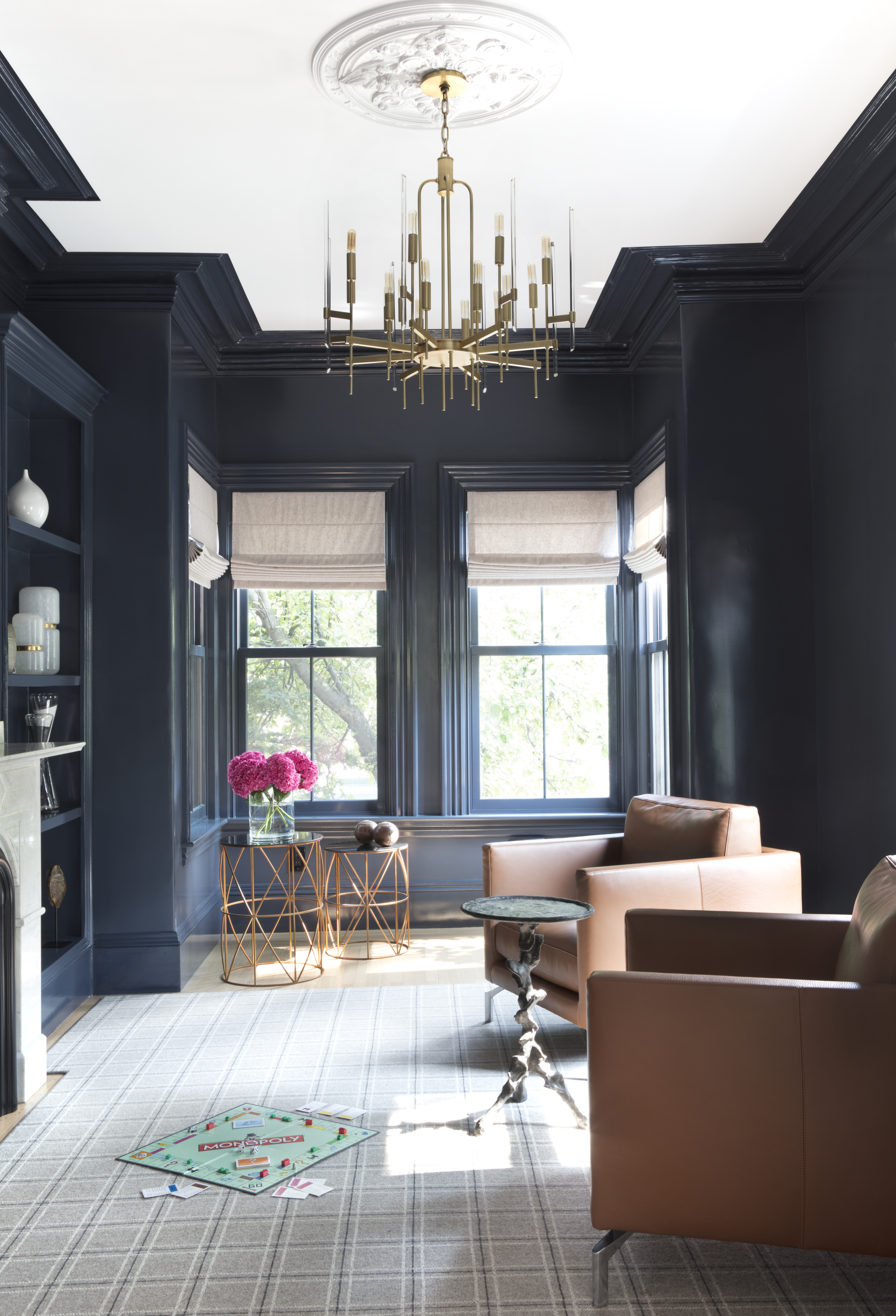
If you're thinking it's time to revitalize your space, giving it a powerful refresh with a few decisive changes, you may want to start with the chandelier.

Selecting a piece that has presence gives the center of a space definition and gravity; when matched to colors and accents throughout the space, it pulls the room together.

Banishing the drab and ushering in the drama, the physicality of Corbett chandeliers redefine the spaces they occupy. 

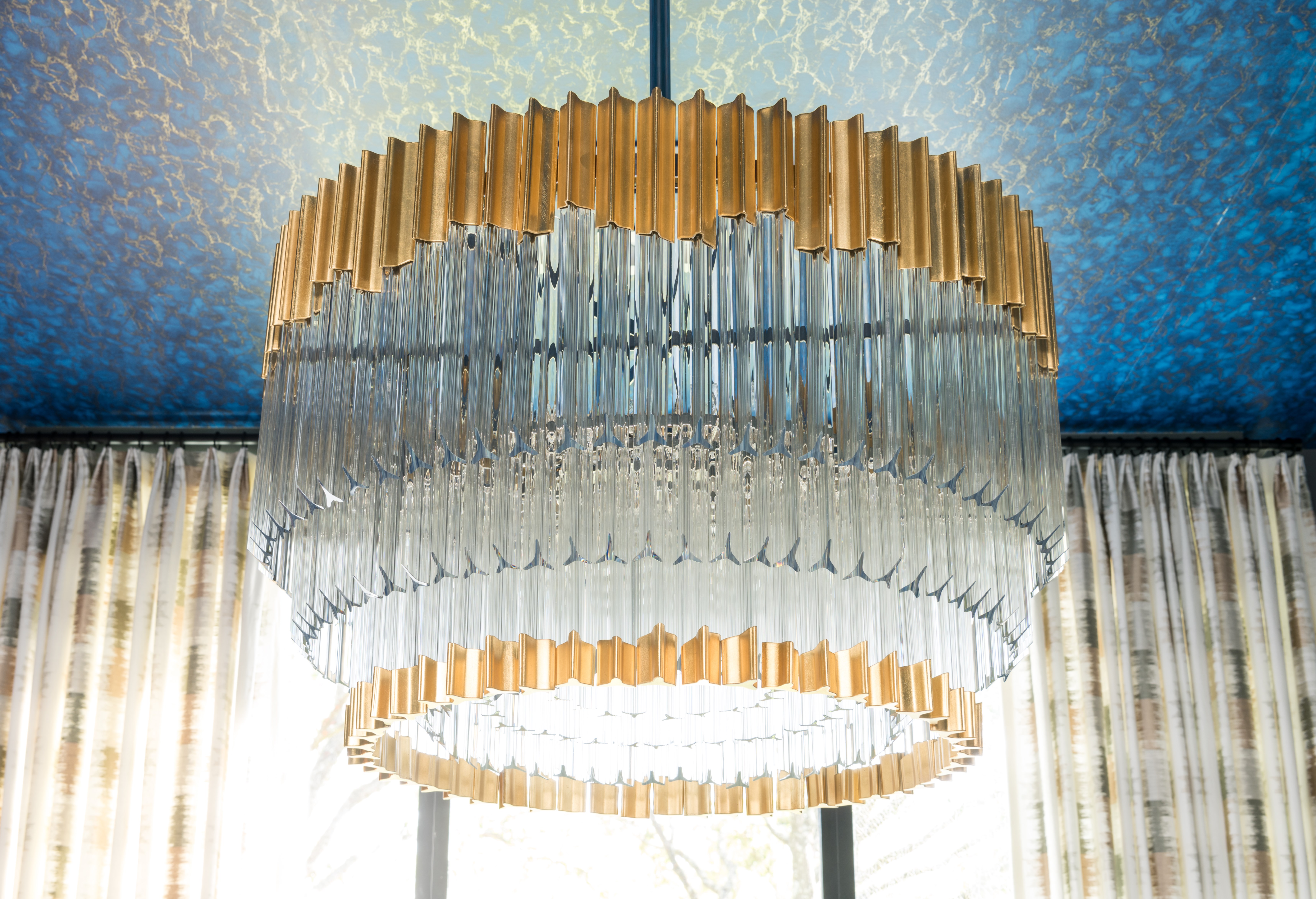
Below, our Charisma, with three layers of handmade glass accented with gold-leaf finished metal on top and bottom makes a decorative impact, refreshing two dining rooms and a bedroom.


Design: Ryan Saghian


Taryn Newton


Design: Laura U Interior Design

Laura U shows us how it's done in this amazing space. Obviously, the incredible work on the ceiling is a major part in this room's transformation. If you look at the header image up top, from the same room, you will see how hints of gold and silver thread their way through the ceiling and the window treatment, amplifying the polished stainless steel rod and gold-leaf accents along the trifurcated crystal in the Charisma chandelier. The proximity of these elements intensifies their connection.

The chairs, too, contribute to this design unity, immediately striking. White and gold, with contrasting organic curves and hard angles, they complement the chandelier beautifully while also subtly connecting to the artwork in its golden square frame in the background. As daylight hits three ringed layers of suspended crystal in the chandelier, they reflect white light, strengthening the impression of this gold, white, silver, grey, and blue palette. 

There are almost more beautiful components to this space than one can enumerate, but clearly, the chandelier commands attention immediately and serves as a unifying force for the many elegant elements that come together for this gorgeous dining area.

This is Kelly GoLightly's living room after selecting a Pulse chandelier from Corbett to complete the space. As she mentions in her useful blog post about picking out a chandelier, she had a great template to build on because the room had been designed for the Traditional Home Modernism Week Showhouse by Barclay Butera. True to the week's theme, Butera outfitted the room with immaculate taste in a style leaning heavy on mid-century modern. 

Kelly kept some of his ideas and added her own furniture and lighting. Favoring bold, white, chrome, and glamour with slightly bohemian touches, Kelly needed a new light fixture that was going to work with those elements and define the space. As you can see, the difference setting a statement-maker piece like Pulse in the space makes is profound. 

You can read the story in Kelly's words and see many more pictures here.


The room in its original form for Modernism Week 


The room after Kelly's transformation

Here are a few more rooms with Corbett chandeliers recently featured on our Instagram feed. Give us a follow for more inspiration!